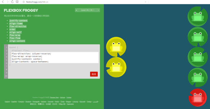
首先先推荐一款游戏
可以通过此游戏对 Flexbox 布局有了一些了解, 感觉用起来确实很方便, 就是属性有些多, 而且需要相互配合, 如果不仔细体会每个属性的含义和作用, 就很容易搞混了.
好了,大家可以去玩通关了。。。
因此借着通关了Flexbox Froggy 游戏, 让我们再稍稍了解下关于 Flexbox 布局的一些细节和要点.
Flexbox 要点
CSS Flexbox 布局是一种新的布局方式, 全称是 CSS Flexible Box Layout, W3C 标准文档 CSS Flexible Box Layout Module Level 1 中给出的介绍如下
CSS 2.1 defined four layout modes — algorithms which determine the size and position of boxes based on their relationships with their sibling and ancestor boxes:
block layout, designed for laying out documents
inline layout, designed for laying out text
table layout, designed for laying out 2D data in a tabular format
positioned layout, designed for very explicit positioning without much regard for other elements in the document
This module introduces a new layout mode, flex layout, which is designed for laying out more complex applications and webpages.
flex布局由被称为 flex container(flex容器) 的父容器和被称为 flex item(flex项) 的直接子元素构成
每个flex子元素沿着 主轴(main axis) 依次相互排列。 交叉轴(cross axis) 垂直于主轴。
属性 flex-direction 定义主轴方向
属性 justify-content 定义了flex子元素如何沿着主轴排列
属性 align-items 定义了flex子元素如何沿着交叉轴排列
属性 align-self 覆盖父元素的 align-items 属性,定义了单独的flex子元素如何沿着交叉轴排列
CSS Flexbox 相关属性速记
|
|
|
|