国庆期间,看了一本讲表格布局的书,发现一些干货,在此做一下记录,查漏补缺。对于表格,我们的态度通常是不屑一顾,偶尔也会冒出一些疑问,比如:
为什么有的时候给单元格设置了border却无效?
为什么设置了某个单元格宽度,但是列宽并没有增加?
单元格的vertcial-align到底是什么鬼…
下面就来解答这些问题^^
表格布局有两种,html布局(html标签)与css布局(css的 display属性)。
表格元素默认的display样式如下:
|
|
在css中,display: inline-table 是指定对象作为内联元素级的表格。
但今天要说的,并不是这种布局,而是浏览器如何“布局”表格。
一些约定,下面文中提到的元素。。。
1)table元素指table标签及display: table,display: inline-table元素
2)cell元素指td,th标签及display: table-cell的元素
3)row元素指tr标签及display: table-row的元素
4)row group元素指tbody,thead,tfoot标签及display: table-row-group,display: table-header-group,display: table-footer-group的元素
5)column元素指col标签及display: table-column元素
6)column group元素指colgroup标签及 display: table-column-group元素
7)caption元素指caption标签及display: table-caption元素
8)表格布局内部元素指cell,row,row group,column,column group元素
网格单元 grid cells
The visual layout of these boxes is governed by a rectangular, irregular grid of rows and columns. Each box occupies a whole number of grid cells, determined according to the following rules. These rules do not apply to HTML 4 or earlier HTML versions; HTML imposes its own limitations on row and column spans.
W3C提到了grid cell的概念,大致是说,表格内部元素排列是基于grid cell。
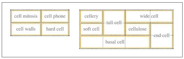
如上图,虚线部分就是grid cell。然而 grid cell 只是用来描述表格内部的元素(cell,row,row group,column, column group)如何排列的,只是理论上的概念,我们无法为其添加样式,也无法通过DOM访问。以单元格为例,一个单元格可以独占一个grid cell,也可以跨域多个grid cell,单元格边框总是在grid cell的边缘之上。
表格之6层结构
css为表格定义了6个层级,浏览器在渲染时css是在对应的层独立绘制,默认每一层的background都是透明的。
从上到下依次是cells层、Rows层、Row groups层、Columns层、Column groups层和Table层。
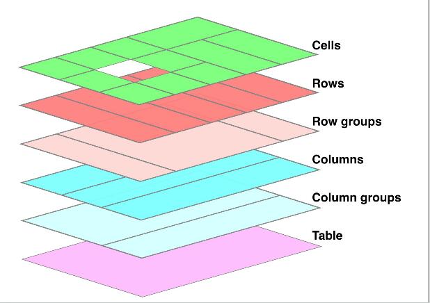
这里需要注意的是,row层总是在column层之上,因此行样式会覆盖列样式。
被限制的column与column group
在css中,表格布局是基于行的,虽然支持column和column group的样式,但是有一些限制。它们只支持四种css属性:background、border、 visibility与width
background: 由于表格6层结构限制,只有在当前column/column group之上的层背景颜色都为transparent时,设置background才有效
border: column/column group的border样式只有在table元素的
border-collapse值为collapse时,才有效。这与表格边框模型有关,下面的会讲到。width: 对column/column group而言,
width其实更像是在设置最小宽度,因为表格的列宽还会受到单元格的影响。visibility: 在其他元素中,
visibility的值为collapse的效果等同visible。但当这个css属性添加到表格元素及表格内部布局元素中时,它的效果就等同于’display: none;’然而visibility在Chrome中并不支持。
|
|
|
|
firefox效果如下:
caption与表格模型
caption是表格中除table元素外唯一一个可以设置margin的。这要从表格布局说起。
In terms of the visual formatting model, a table can behave like a block-level (for ‘display: table’) or inline-level (for ‘display: inline-table’) element.
In both cases, the table generates a principal block box called the table wrapper box that contains the table box itself and any caption boxes (in document order). The table box is a block-level box that contains the table’s internal table boxes. The caption boxes are block-level boxes that retain their own content, padding, margin, and border areas, and are rendered as normal block boxes inside the table wrapper box. Whether the caption boxes are placed before or after the table box is decided by the ‘caption-side’ property, as described below.
The table wrapper box is a ‘block’ box if the table is block-level, and an ‘inline-block’ box if the table is inline-level. The table wrapper box establishes a block formatting context. The table box (not the table wrapper box) is used when doing baseline vertical alignment for an ‘inline-table’. The width of the table wrapper box is the border-edge width of the table box inside it, as described by section 17.5.2. Percentages on ‘width’ and ‘height’ on the table are relative to the table wrapper box’s containing block, not the table wrapper box itself.
The computed values of properties ‘position’, ‘float’, ‘margin-*’, ‘top’, ‘right’, ‘bottom’, and ‘left’ on the table element are used on the table wrapper box and not the table box; all other values of non-inheritable properties are used on the table box and not the table wrapper box. (Where the table element’s values are not used on the table and table wrapper boxes, the initial values are used instead.)
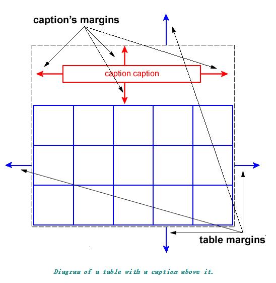
最外层是table wrapper box,它包含caption box与table box,table box中是之前提到的一些内部元素(cell,row,row group,column,column group)。而caption box始终置于table box上方,它本身是块级元素。当我们给table元素添加css属性时,定位相关的css属性(position、float、top、right、bottom、left)与margin、caption可继承的属性是加在table wrapper box上的,而不可继承的属性则是加在table box上。
匿名元素
应该会有不少小伙伴对表格实现水平垂直居中很有好感,又因为书写麻烦而对之望而却步。
|
|
那使用css表格布局实现呢?就是辣么简洁
|
|
|
|
这要归功于css匿名表格对象的机制。规则如下:
1) 如果table-cell元素的父元素不是table-row元素,则插入匿名table-row对象
2) 如果table-row元素的父元素不是table、inline-table或table-row-group元素,则插入匿名table元素
3) 如果table-column元素父元素不是table、inline-table或table-row-group元素,则插入匿名table元素
4) 如果table-row-group、table-header-group、table-footer-group、table-column-group或table-caption的父元素不是table元素,则插入匿名table元素
5) 如果table元素或inline-table元素的子元素不是table-row-group、table-header-group、table-footer-group、table-column-group或table-caption,则插入匿名table-row元素
6) 如果table-row-group、table-header-group、table-footer-group元素的子元素不是table-row元素,则插入匿名table-row元素
7) 如果table-row元素的子元素不是table-cell元素,则插入匿名tabel-cell元素
表格边框模型
table元素的border-collapse属性我们应该都不陌生。它的值separate与collapse分别对应了表格的两种边框模型separated border model与collapsed border model。
separated border model
当边框模型为separate时,我们可以设置border-spacing属性,控制单元格之间的间距。也可以在table元素上设置padding,控制表格与其内部元素之间的间距。
|
|
但需要注意的是,这种模型下,border-spacing属性只在table元素上有效,在其内部元素中设置border属性会被忽略。
cell元素的empty-cells属性
Values:show|hide|inherit|initial
应用于display: table-cell的元素,只在表格的border-collapse的值为separate时,此属性有效。
值为show,则内容为空时它的边框与背景样式可见。
值为hide,如果当前单元格所在的行都为空元素,则row表现为display:none
注意,html表格布局与css表格布局元素毕竟有差异,在写demo时,如果是css表格布局,可以把单元格元素的width与height属性都写上。css表格布局时,如果不给cell元素添加width与height属性,empty-cells可能看不到效果。
collapsed border model
这种模型下,table及其内部元素(caption除外)都可以设置border属性,但是table元素的border-spacing与padding就无效。
关于row的宽度如何计算。
相较于分隔边框模型,这种合并边框模型在计算宽度时要更加费事:
row width = (0.5 border-width-0) + padding-left-1 + width-1 + padding-right-1+ border-width-1 + padding-left-2 +…+ padding-right-n + (0.5 border-width-n)
当后一个row与前一个row中边框宽度不一致时,如何表现:
浏览器首先会计算出表格本身的左边框与右边框的宽度,它将第一行中第一个单元格的左边框的宽度的一半作为表格的初始左边框宽度,将第一行中最后一个单元格的右边框的一半作为表格初始右边框宽度。对于奇数边框,浏览器在渲染时还需要处理如何把border和grid-line对齐的问题。
对于任何之后的行,如果他们的边框宽度大于初始宽度,就归为表格的外边距区域中。
如果table元素添加overflow:hidden;发现超出部分被隐藏。
合并边框的样式优先级规则
1)border-style:hidden优先级最高,该边框会被隐藏
2) border-width值更大,优先级更高
3) 当border-width都一样时,需要看border-style,优先级从高到低依次是double,solid,dashed,dotted,ridge,outset,groove,inset,none
4) 如果border-width与border-style都一样,看border-color是在哪个元素上定义的,优先级从高到低依次是cell,row,row group,column,column group,table元素
5) 如果border-color是在同种元素上定义的,则位置靠左和靠上的元素优先
demo1:
demo2:
表格宽度布局
表格在计算宽度时也有两种计算方式,这是由它的table-layout属性所决定的。值fixed与auto分别对应两种宽度布局:固定宽度布局fixed-width layout 与 自动宽度布局automatic-width layout
这两者最明显的区别就是,固定宽度布局速度更快。
固定宽度布局
固宽布局不依赖表格的单元格内容。表格的列宽是由表格第一行的元素决定的,之后几行的单元格宽度不需要再计算,设置width值也会被忽略。然而,当单元格内容过多超出单元格时,就不那么美妙了,或许需要使用overflow: hidden隐藏溢出,或者使用word-break: break-all;word-wrap: break-word;强制换行。
固宽布局时表格是如何渲染的呢?
column的宽度是这样计算的:
1、如果column元素的width属性有值(非auto),为这一列设置宽度
2、如果colum的width值为auto,看表格中第一行的在这一列的单元格的width值是否为auto,如不为auto,为这一列设置宽度。如果单元格跨列,宽度均分后设置
3、对于
width为auto的列,它的宽度是在table的width值-colum固定宽度值的总和之后,平均分配的。4、column的
width值更像是最小宽度,当第一行中这一列单元格宽度大于column的width值时,单元格优先。
表格的宽度可能是table元素的width值也可能是各个column宽度总和,就看哪一个值更大了。如果表格的宽度更大。则多余的宽度会被平均分配给各个column。
自动宽度布局
自动宽度布局,速度上虽然不如前者,但它是表格的默认宽度布局方案。慢的原因在于表格的每一个单元格宽度都需要计算。
这种布局下,表格的宽度需要依据各个colum的宽度,每一个column的宽度都需要计算出最小宽度和最大宽度,它们是由每一列的单元格所决定的。每一个单元格的宽度是由其内容决定,它也需要根据一些规则计算自己的最小宽度与最大宽度。
如果表格的width不为auto,它需要计算出column宽度、border与单元格间距的总和,将这个总和值与width比较,取大值。如果width更大,多余的宽度会均分给所有的列。如果表格的计算属性width是auto,则表格宽度就是由总和值决定。
表格的宽度依赖于单元格,单元格的宽度依赖于单元格内容,当所有这些都计算好的时候,浏览器才开始布局。
表格高度值,就是像最小高度啦。
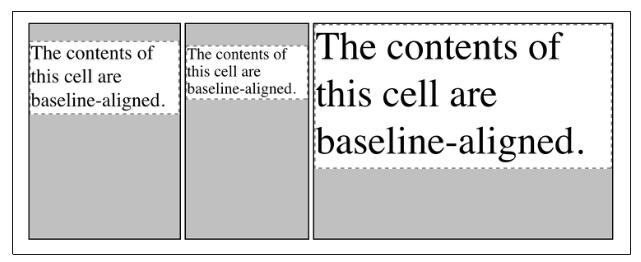
垂直对齐
vertial-align元素,这个大家都很熟悉。但在单元格中,它略有不同。只有四种取值,top,middle,bottom,baseline,是内容居于单元格什么位置的意思。设置居中方式后,内容高度与单元格之间的高度差用单元格自身的间距填充。
其余三种都不需要解释,但我想对于基线对齐baseline,很多人会有疑惑。
单元格的baseline对齐是与它所在的行的baseline对齐。而行的baseline是由初始单元格baseline的最低值决定的(即取该行中所有单元格内文本的第一行的基线中最低的一个)
如图所示:
参考文档
《OReilly Table Layout in CSS》